Toolbar and Editor#
Before building the toolbar, we looked at how other products handle it to make sure our approach matches what users expect. The most recognizable and well-established toolbars—such as those in Google Docs and Microsoft Word—served as primary references. However, we also observed that toolbars appear in many other applications (e.g., Brightspace assignment submissions, GitLab’s editor) yet often go unnoticed. This shows how intuitive their design is—when toolbars work well, users don’t think about them.
Why Follow Established Patterns?#
We deliberately adopted a familiar toolbar structure for several reasons:
Designed for quick understanding - Users already understand standard layouts (e.g., formatting buttons on the left, action items like ``Save’’ on the right).
Consistency - Similar icons (e.g., bold (B), italic (I), lists) minimize learning curves.
Functionality Expectations - Users expect basic features (text styling, undo/redo) to be readily accessible.
Accessibility - Established toolbars often adhere to accessibility best practices (e.g., keyboard navigation, icon labels).
We followed these patterns instead of reinventing the wheel, so the toolbar feels intuitive—not just different for the sake of it.
Technology Choices#
For development, we chose SolidJS due to its:
Performance - Unlike React’s virtual DOM or Vue’s reactivity system, Solid.js compiles your code to targeted DOM updates without the diffing step.
Fine-Grained Reactivity - While Svelte compiles components and Angular runs change detection, Solid’s reactivity updates only the affected DOM nodes.
However, compared to other frameworks, SolidJS has some drawbacks:
Smaller Community - Solid has a smaller ecosystem and fewer third-party libraries than React or Vue.
Less Mature Tooling - Some development tools and integrations are less polished compared to more established frameworks.
Considering these pros and cons, SolidJS provides the best balance of performance and reactivity for our project’s needs.
For icons, we used Bootstrap Icons because they:
Offer a comprehensive library covering common toolbar actions.
Are lightweight and easy to integrate.
Provide better coverage of common actions compared to limited free tiers of other alternatives.
This combination of proven design patterns and efficient technology resulted in a toolbar that feels familiar, performs well, and meets user expectations without unnecessary complexity.
First mock-ups vs Final Toolbar#
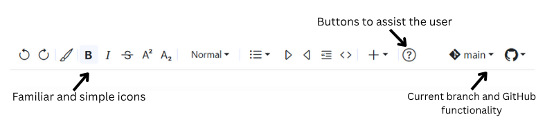
The first mock-ups of the toolbar are shown in Appendix C. Several designs and layouts were explored; however, many of them include functionalities that are not supported by TeachBooks and MyST. The final design, shown below (Figure 4.2) and largely based on our full toolbar mock-up (Figure C.13 in Appendix C), is similar but includes some changes: certain buttons, such as the format painter and help button, have been reordered, while others—like underline and font size—were removed due to lack of support.

Figure 4.2: Final look of the toolbar - screenshot of the toolbar from our own extension, running on a TeachBook in the browser.